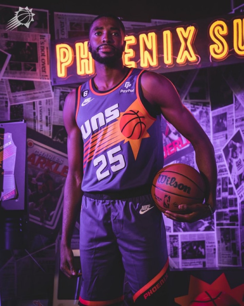
2017-2018 New Suns Uniforms
Re: Suns News: The Offseason
I don't like how big the lettering is on the front for the home jersey. I think SUNS is way too big, crowds the entire front.
Re: Suns News: The Offseason
Why don't they have any sort of sun, or basketball, or sunstripes / sunburst, or anything? It just says "SUNS" in capital letters, and a number. It's quite generic IMO.
-
The Bobster

- Posts: 7731
- Joined: Fri Mar 14, 2014 1:04 pm
- Location: Phoenix, AZ
Re: Suns News: The Offseason
And we know the retro will be the 1968-69 uniform for the 50th anniversary.carey wrote:We have like 2 more and a retro still coming.Marty [Mori Chu] wrote:To me it looks just like the last one. Maybe I'm wrong. That font of the letters saying "SUNS" or "PHOENIX" looks just like the last one to me. What is different? At least they didn't put that dumb "PHX" abbreviation on everything. And no black and gray, yay.
Author of The Basketball Draft Fact Book: A History of Professional Basketball's College Drafts
Available from Scarecrow Press at - https://rowman.com/ISBN/9780810890695
Available from Scarecrow Press at - https://rowman.com/ISBN/9780810890695
Re: Suns News: The Offseason
I agree. I wanted the sunburst back. Not just a small one at the waist and half of one on shorts.Marty [Mori Chu] wrote:Why don't they have any sort of sun, or basketball, or sunstripes / sunburst, or anything? It just says "SUNS" in capital letters, and a number. It's quite generic IMO.
-
The Bobster
- Posts: 7731
- Joined: Fri Mar 14, 2014 1:04 pm
- Location: Phoenix, AZ
Re: Suns News: The Offseason
That seems to be the trend. I would have loved an updated sun on the shorts - something like they wore in the 70's.Marty [Mori Chu] wrote:Why don't they have any sort of sun, or basketball, or sunstripes / sunburst, or anything? It just says "SUNS" in capital letters, and a number. It's quite generic IMO.
Author of The Basketball Draft Fact Book: A History of Professional Basketball's College Drafts
Available from Scarecrow Press at - https://rowman.com/ISBN/9780810890695
Available from Scarecrow Press at - https://rowman.com/ISBN/9780810890695
-
The Bobster
- Posts: 7731
- Joined: Fri Mar 14, 2014 1:04 pm
- Location: Phoenix, AZ
Re: Suns News: The Offseason
All things said, I would rather have then go to conservative than have a monstrosity like the Hawks wear!
Author of The Basketball Draft Fact Book: A History of Professional Basketball's College Drafts
Available from Scarecrow Press at - https://rowman.com/ISBN/9780810890695
Available from Scarecrow Press at - https://rowman.com/ISBN/9780810890695
Re: Suns News: The Offseason
Apparently so.Split T wrote:I kinda like the purple ones. Also, does this mean Jackson is gonna wear #20? And aren't we supposed to have a few more? I'm sure we'll still have an orange one right?

Synchronicity and all that jazz, man.
Re: Suns News: The Offseason
I like them. I'm glad they simplified things. I like the lack of a predominantly orange jersey. I like the loss of gray as an accent color. I'm overall happy.

Synchronicity and all that jazz, man.
Re: Suns News: The Offseason
Afterburners.carey wrote:What bothers me are the flames on the shorts are only on the back half of them so it's like they are shooting out while you're running or something? That's dumb.
Synchronicity and all that jazz, man.
Re: 2017-2018 New Suns Uniforms
I kind of like them, but I have a hard time caring too much about this stuff.

Re: 2017-2018 New Suns Uniforms
I like the Wolves new unis.http://www.espn.com/nba/story/_/id/2030 ... -18-season
I just noticed they gave us a C-. Woof.
I just noticed they gave us a C-. Woof.
Go Suns!
Og Snus!
Og Snus!
Re: 2017-2018 New Suns Uniforms
Not too bad. Reminds me of the Wizards jerseys.carey wrote:I like the Wolves new unis.http://www.espn.com/nba/story/_/id/2030 ... -18-season
I like the revamped Pelicans jerseys too. Happy to see New Orleans in bigger font.
"There are 3 rules I live by: never get less than 12 hours sleep, never play cards with a guy with the same first name as a city & never get involved with a woman with a tattoo of a dagger on her body. Everything else is cream cheese."
Re: 2017-2018 New Suns Uniforms
Apparently they loved our old ones, I thought they were fine, but nothing special.carey wrote:I like the Wolves new unis.http://www.espn.com/nba/story/_/id/2030 ... -18-season
I just noticed they gave us a C-. Woof.
-
Ring_Wanted
- Posts: 5327
- Joined: Wed Feb 26, 2014 11:47 am
Re: Suns News: The Offseason
Agreed. Also dislike the borders in the sides and back. Don't like the shorts either. Purple ones are way better than the home ones, although to me that's not saying much.iLLmatic wrote:I don't like how big the lettering is on the front for the home jersey. I think SUNS is way too big, crowds the entire front.
Very underwhelming. Big downgrade. Can't see myself spending on these kits (have just ordered Booker's black alternate and this new stuff doesn't make me regret at all).
Re: 2017-2018 New Suns Uniforms
I chuckled that the mannequin body wearing the unis is super jacked. Aspirational mannequin man is here!
Re: 2017-2018 New Suns Uniforms
Moreover do the shorts have to be so goddamn tight on the mannequin.Marty [Mori Chu] wrote:I chuckled that the mannequin body wearing the unis is super jacked. Aspirational mannequin man is here!

Re: Suns News: The Offseason
The only thing that bothers me is the beveling. It makes it look cartoonish. Everything else is exactly what you want in a Suns jersey--Purple, Orange, and White.The Bobster wrote:Big improvement. I would have gotten rid of the butt stripe though, and could do without the beveling on the word mark.
But they're back to mainly purple & orange, which makes me happy.
Re: 2017-2018 New Suns Uniforms
I think Bledsoe is much more jacked than those mannequins.Marty [Mori Chu] wrote:I chuckled that the mannequin body wearing the unis is super jacked. Aspirational mannequin man is here!

Re: 2017-2018 New Suns Uniforms
in Ott we trust